What a Useful User Journey Looks Like on a Service-Business Website
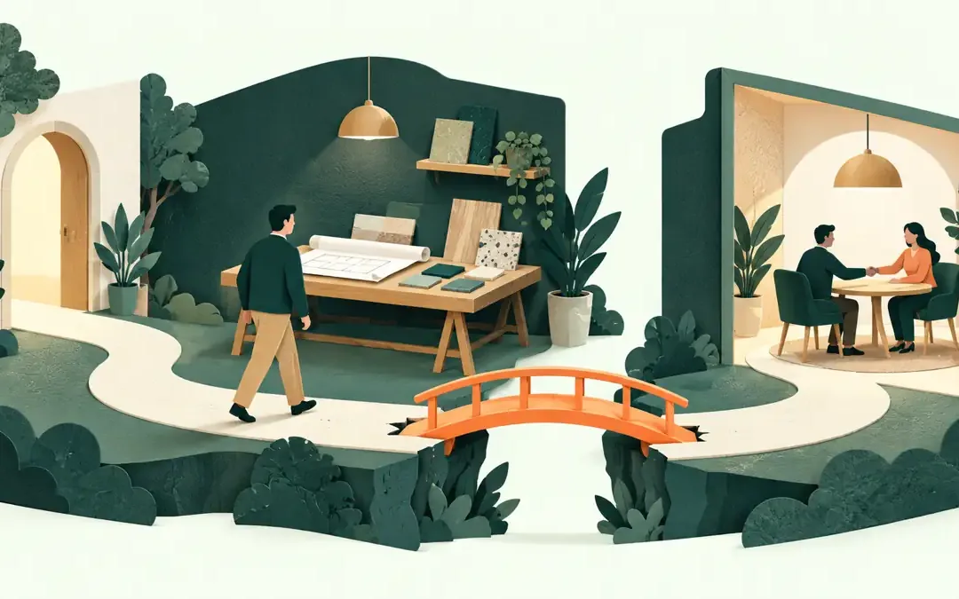
Someone looking for a new accountant may arrive on your website through a Google result for one particular service. They have not seen your homepage or heard your carefully rehearsed introduction. They want to know whether you work with businesses like theirs, what...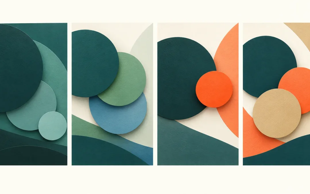
How to Choose a Colour Harmony for Your Website
Choosing colours for a website often starts with a favourite shade. Then comes the harder part: what should sit beside it, where should each colour appear, and will the whole page still feel like the same business? A colour harmony gives you a useful starting...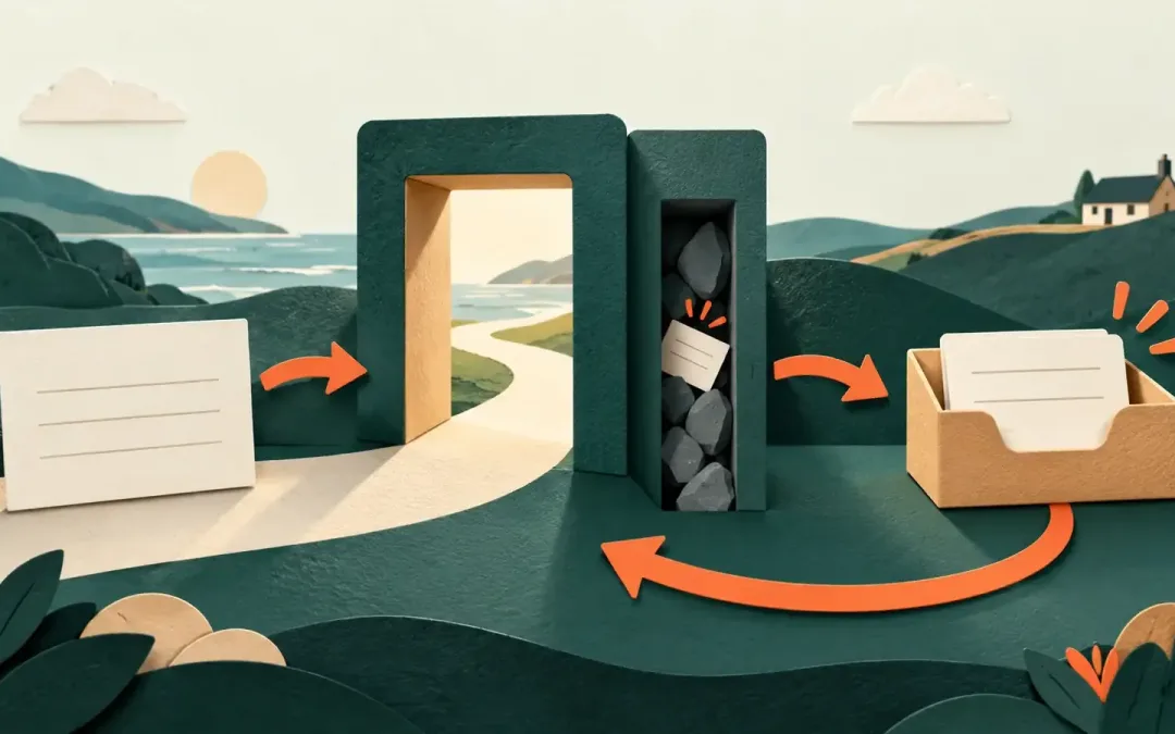
Why Contact Forms Lose Good Enquiries
A contact form is often the last step between a promising visitor and a new conversation. If it feels like an interrogation, breaks on a phone or sends a message nobody sees, the problem is larger than a slightly untidy page. A person who was ready to ask about your...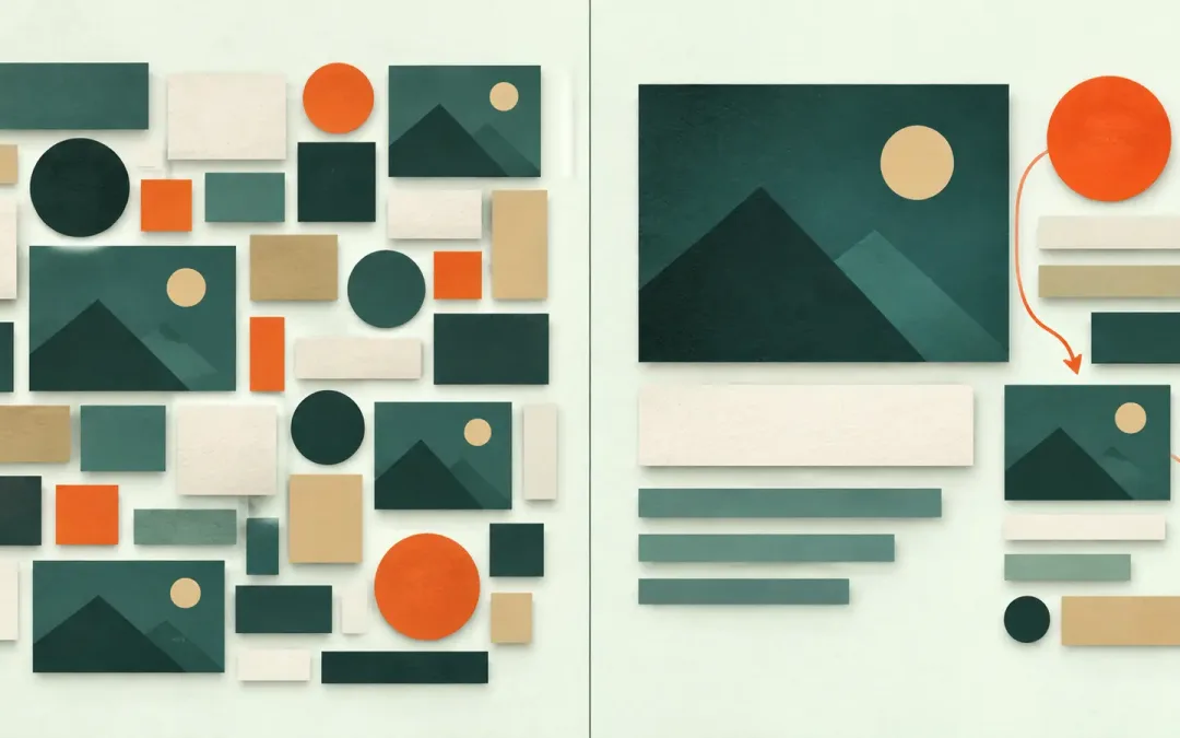
What Visual Hierarchy Does Before a Visitor Starts Reading
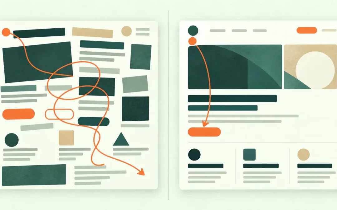
Visual hierarchy in web design is the order in which a page asks to be understood. Before a visitor reads the sentences properly, the design is already suggesting: begin here, notice this next, treat these items as related, and use this action when you are ready. When...