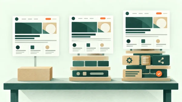
Open two websites offering broadly similar services and you may trust one of them almost immediately. You have not checked every claim, compared every price or read the About page. Nevertheless, one feels established and considered while the other feels uncertain.
That judgement can be unfair. A brilliant business can have a poor website, and a polished website can flatter a mediocre business. Yet first impressions still influence whether somebody stays long enough to discover the truth.
Professional design is not a layer of decoration applied at the end. It is the visible result of order: decisions about what matters, what belongs together and what the visitor should notice next.
People judge the visual system before the sentences
Stanford's web-credibility guidance, based on research involving more than 4,500 people, notes that visitors quickly evaluate a website by its visual design. It specifically points to layout, typography, imagery and consistency. The research is old enough that its examples belong to another era of the web, but the underlying point remains useful: people use visible cues as a shortcut when deciding whether a site deserves further attention.
There is also an established “aesthetic-usability effect”. Nielsen Norman Group describes this as our tendency to perceive attractive interfaces as easier to use. Good visual design can make people more patient with minor problems. It cannot rescue a genuinely confusing experience for long, but it can earn the site a little initial goodwill.
That is why “looking professional” matters. It is not vanity. It is an early signal that somebody has thought about the experience.
Clear hierarchy tells the eye where to begin
A well-designed page has a visible order. The main heading looks more important than the supporting paragraph. The primary action is easier to spot than a secondary link. Related items are grouped; unrelated items have room between them.
When everything is large, bright or bold, nothing is genuinely prominent. The visitor has to work out the hierarchy for themselves. This is common on sites assembled one section at a time: each new promotion is made louder than the last until the page resembles six people trying to speak over one another.
A professional hierarchy usually has restraint. It may use only a few heading sizes and one clear button style. The distinction between levels is obvious without becoming theatrical.
Spacing is doing more work than most people realise
White space is sometimes treated as unused space. In practice, it is one of the main ways a layout communicates structure.
Consistent spacing shows which heading belongs to which paragraph, where one idea ends and another begins, and whether two controls are related. It also gives important content room to register. A page can contain excellent writing and imagery yet still look amateurish if margins shift arbitrarily and elements almost collide.
The important word is consistent. Professional spacing tends to follow a system: perhaps a small gap within a component, a medium gap between related components and a larger gap between sections. The exact measurements matter less than the relationships.
Alignment has a similar effect. Text, images and controls that share deliberate edges make a page feel settled. Small misalignments are surprisingly visible, even when the visitor could not name what is wrong.
Typography should make reading feel uneventful
Typography is not only the choice of typeface. It includes line length, line height, size, weight, contrast and the way headings relate to body copy.
A sensible body font at a comfortable size will usually look more professional than a fashionable but tiring one. Paragraphs need enough line spacing to remain open, while lines should not stretch so far across a desktop screen that the reader loses their place.
Using too many fonts or weights weakens the system. Two well-chosen typefaces are often ample; one flexible family may be enough. The aim is not for visitors to admire the typography as a separate performance. It is for the words to feel easy to approach.
Colour works best when it has jobs
A professional palette normally gives colours defined roles. One may identify important actions, another may support headings, while neutral colours handle backgrounds and ordinary text.
If the brand colour appears on every button, icon, border and heading, it stops signalling importance. If five unrelated accent colours compete across a page, the interface begins to feel accidental.
Contrast matters too. Subtle grey text can look elegant on a designer's large display and become needlessly difficult on a phone in daylight. WCAG 2.2 remains the current W3C accessibility recommendation, and its contrast requirements are a useful minimum rather than an aesthetic nuisance. A site that excludes readers for the sake of delicacy is not especially sophisticated.
Imagery must belong to the business
Strong photography can establish quality quickly, but only when it feels relevant. Generic photographs of handshakes, anonymous laptops or improbably delighted meeting rooms often weaken trust because they reveal nothing about the actual service.
For a consultant, practice or trades business, useful images might show the person, the working environment, the process or the finished result. A restrained graphic may be more convincing than an unrelated stock photograph chosen merely to fill a rectangle.
Image treatment should also be consistent. A mixture of sharp professional photographs, blurry phone images, clashing illustration styles and mismatched aspect ratios makes the page feel assembled rather than designed.
Repetition creates confidence
Good interfaces repeat decisions. Buttons behave alike. Cards share the same internal spacing. Headings use the same scale. Links are recognisable. The visitor learns the visual language once and can then concentrate on the content.
This is one reason a design system matters even on a modest five-page website. It does not need a grand manual. A small set of agreed colours, type sizes, spacing values, button treatments and reusable components is enough to prevent gradual drift.
Consistency should not become monotony. A case study can have a different rhythm from a contact page. The underlying rules simply make those variations feel as though they belong to the same organisation.
Visual rhythm makes the page easier to predict
Hierarchy explains what is important; rhythm helps the visitor anticipate how the page will continue. Repeated intervals between headings, paragraphs, images and sections create a quiet pattern. Once that pattern is established, a deliberate change—a larger gap, a contrasting panel or a single peach-coloured button—carries meaning.
Without rhythm, even individually attractive components can feel unrelated. One section may be very dense, the next unexpectedly sparse and the next built from cards with entirely different proportions. The visitor may not consciously measure any of this, but the page begins to feel as though several designs have been joined together.
A useful test is to ignore the words and look only at the shapes. Are text blocks similar where their purpose is similar? Do important sections receive more space? Does the eye move down the page in a comprehensible sequence, or keep being pulled sideways by unrelated accents?
This is also why copying isolated sections from several admired websites rarely produces the desired polish. Each original section belonged to its own spacing, type and colour system. Removed from that system, the parts may be handsome but they no longer speak the same visual language.
Professional design also survives a phone screen
A spacious desktop composition is only half a design. On a small screen, columns stack, headings wrap and buttons compete for limited room. A professional result accounts for that deliberately rather than hoping the layout will shrink politely.
It also loads without making the visitor wait through oversized images, animation libraries and unnecessary scripts. Google's current Core Web Vitals focus on loading speed, responsiveness and visual stability. Those measurements are not a complete definition of quality, but they capture three irritations that make even an attractive site feel poorly made: slow arrival, sluggish interaction and content jumping around while somebody tries to use it.
The quiet credibility signals matter
Visual polish works best when it is supported by evidence that a real, attentive business sits behind the screen. Clear contact details, current information, genuine photographs, specific service descriptions and error-free pages all contribute.
This is where professionalism becomes more than a look. The design makes the evidence easy to find, and the evidence justifies the confidence created by the design.
An immaculate hero section followed by vague claims and no identifiable person will eventually feel hollow. A restrained site that clearly explains who does the work, who it is for and what happens next is usually more persuasive.
Professional does not have to mean corporate or bland
There is a persistent idea that professional design must be cautious to the point of anonymity: dark blue, a conventional sans-serif typeface and a photograph of people around a meeting table. That can be appropriate, but it is not a universal formula.
A craft business, therapist, architect and accountant may all need to appear credible while expressing very different qualities. One may benefit from tactile detail and warmth; another from calm precision; another from strong colour and an editorial feel. Personality becomes unprofessional only when it interferes with recognition, reading or trust.
The more useful question is whether the visual choices feel intentional and appropriate. An unusual typeface used carefully can look more assured than a conventional one used badly. A strong colour can make a business memorable when it has a defined role. Asymmetry can give a layout energy while alignment and spacing keep it coherent.
Professionalism is therefore not a particular style. It is the impression that the style has been chosen for this business, applied with control and tested against the visitor's needs.
A quick first-impression check
Stand back from your homepage—or take a screenshot and view it at a smaller size—and ask:
- Is there one obvious place for the eye to begin?
- Can I distinguish the main action from secondary choices?
- Do spacing and alignment feel consistent?
- Is the body text comfortable rather than merely stylish?
- Are colours performing clear roles?
- Do the images add specific meaning?
- Does the mobile version feel designed, not compressed?
- Can a visitor see that a real and contactable business is behind it?
You do not need to chase every design trend. In fact, doing so can make a site date more quickly. The more durable goal is coherence: a visual system appropriate to the business, applied consistently and shaped around what the visitor needs to understand.
That is what makes a website look professional before anybody reads a word. Once they do begin reading, the structure and substance must keep the promise.
If your site feels vaguely “off” but the problem is difficult to name, my web design services begin with understanding the business and the visitor rather than prescribing decoration. You can also read about my design process or get in touch for a straightforward second opinion.
Sources and further reading
- Stanford Guidelines for Web Credibility
- The Aesthetic-Usability Effect — Nielsen Norman Group
- Web Content Accessibility Guidelines (WCAG) 2.2 — W3C
- Web Vitals — web.dev
Important note
This article provides general information and professional commentary. It is not advice tailored to your particular business, website or circumstances, and it should not be treated as legal, financial, privacy, accessibility, cybersecurity or other specialist advice. Any opinions are my own professional judgement based on the information available when the article was researched.
Products, prices, services, software and official guidance can change. External links are provided for reference; I do not control third-party websites and cannot guarantee their continuing availability, accuracy or content. A link does not imply endorsement of everything published by that source.
Check current official information before making an important decision. Test technical changes safely, keep a verified backup, and obtain appropriately qualified advice where the consequences warrant it. Any sponsorship, free product, affiliate link or other commercial relationship relevant to the article will be clearly disclosed.