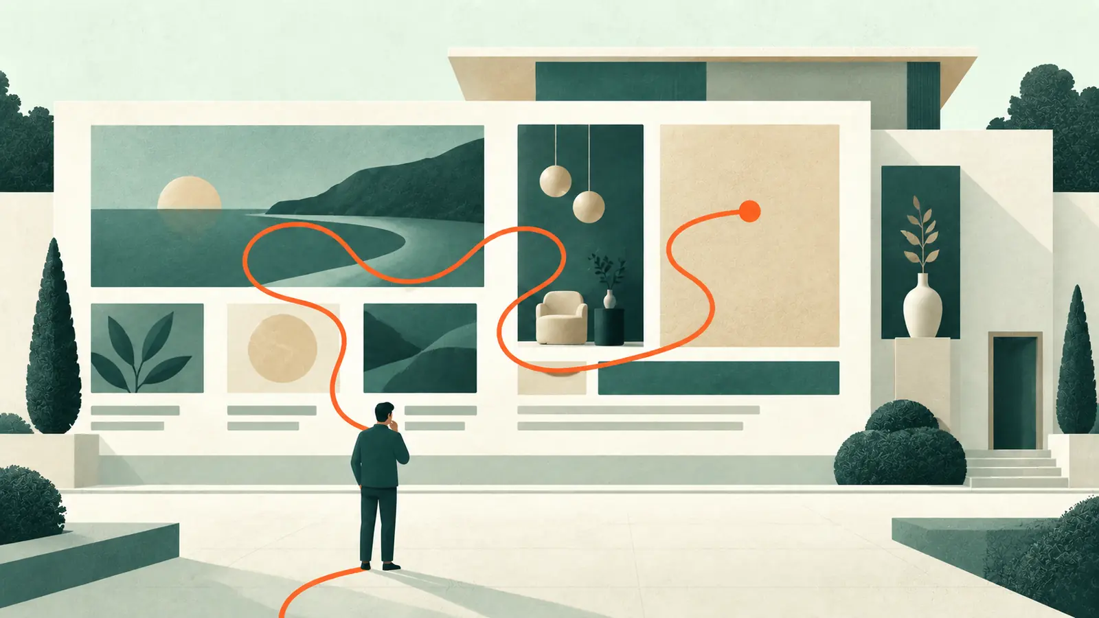
A homepage can win compliments and still produce very few enquiries. The colours are tasteful, the animation is smooth and everybody involved likes the photographs. Yet the contact form remains stubbornly quiet.
That does not mean visual design is irrelevant. Attractive interfaces can feel easier to use and can make people more patient with small imperfections. The problem begins when beauty is asked to do work that belongs to clarity, structure, evidence and a well-planned next step.
A service-business homepage is not a poster. It is the entrance to a decision.
Your visitor arrives with questions, not admiration
Most prospective clients are not opening a website in order to appreciate its composition. They are trying to reduce uncertainty.
They may be asking:
- Does this person provide the service I need?
- Do they work with a business like mine?
- Are they based in, or available to, my area?
- Can I trust them with the problem?
- Is this likely to suit my budget?
- What happens if I make contact?
The homepage does not need to answer every question immediately. It does need to show that answers exist and make the right route feel obvious.
Nielsen Norman Group uses the term “information scent” for the cues people use to estimate whether a link or page is likely to give them what they need. Clear labels, relevant surrounding copy and familiar language strengthen that scent. Vague links such as “Discover”, “Explore” or “Learn more” often make the visitor guess.
A vague hero section wastes the most valuable space
The first screenful usually carries a disproportionate burden. It should help the right visitor recognise the business and decide whether to continue.
“Creating digital experiences that inspire” may sound polished, but it does not say whether the company designs websites, sells training or hires out virtual-reality equipment. A more useful heading names the service and, where helpful, the audience or outcome.
This does not require cramming a complete business plan above the fold. A strong opening can be simple:
- What the business does.
- Who it mainly helps.
- Why its approach is relevant.
- One clear next action.
If the photography is dramatic but the proposition is missing, visitors may admire the image while remaining unsure whether they are in the right place.
One homepage may need several journeys
Service businesses often have more than one kind of visitor. A new business may need its first website. An established practice may need a redesign. An existing client may be looking for support.
Trying to speak to all of them in one long paragraph creates fog. A better homepage acknowledges the main journeys and gives each a clear route: “I need a new website”, “My current site is underperforming” or “I need ongoing care”, for example.
These paths do not have to look like large buttons. They can be service cards, short problem-led sections or well-labelled links. The important part is that the labels describe the destination. Visitors should not need insider language to understand which door is theirs.
Service enquiries require confidence before commitment
Product pages often have a clearly understood transaction: select an item, check the price and buy it. Service businesses usually ask for a more ambiguous commitment. “Book a consultation” may lead to a conversation, a proposal, several weeks of work and a meaningful expense. The visitor is not simply choosing a button; they are judging whether beginning that relationship feels safe and worthwhile.
That makes the steps before the form unusually important. A prospective client may need to understand whether the service suits a business of their size, whether they will deal with a named person, how the process works and what sort of budget is realistic. If the homepage withholds all of that in the hope of forcing an enquiry, many visitors will leave rather than volunteer for an uncertain sales conversation.
A useful homepage reduces uncertainty in stages. It establishes relevance, gives enough substance to make the claim believable, offers proof suited to the concern and explains what happens next. The call to action then feels like the natural continuation of the page rather than a sudden request.
This is why conversion advice borrowed from ecommerce can be misleading for professional services. Urgency, scarcity and repeated buttons may increase pressure while reducing trust. The better route is often calmer: clearer fit, more specific evidence and a next step proportionate to the decision.
Calls to action are part of the conversation
Many homepages make one of two mistakes. They either offer no obvious action, or repeat “Book now” so insistently that the site feels impatient.
The appropriate call to action depends on how considered the purchase is. Somebody choosing a web designer may not be ready to book a project after reading eight lines. They may be ready to view relevant work, understand the process, see an indicative price or arrange an exploratory call.
A useful page can therefore have a primary action and quieter secondary actions. “Discuss your website” might be primary. “See how the process works” can help a visitor who needs more reassurance first.
Button labels should say what will happen. “Submit” describes what the system does; “Send my enquiry” describes what the person is doing. “Click here” says almost nothing.
Proof is strongest near the doubt it answers
A row of logos or testimonials near the bottom of the page may help, but proof works better when it appears beside the claim it supports.
If you say the process is collaborative, link to a clear description of that process. If you specialise in a sector, show an appropriate example. If clients value responsiveness, use a specific testimonial that mentions communication rather than a generic “highly recommended”.
For a small service business, trust may come from very ordinary details: a real name and photograph, an identifiable location, a direct explanation of who does the work and a realistic description of what happens next.
Stanford's credibility guidance includes showing the real organisation, highlighting expertise, making contact easy and avoiding errors. Those points are not substitutes for good design. They are the substance the design should reveal.
Friction often appears at the final step
A visitor can follow the whole page and then abandon an awkward enquiry form. Common causes include too many required fields, unclear labels, intrusive questions asked too early or no reassurance about what happens after submission.
The W3C recommends that form controls have proper labels and that instructions explain required information and expected formats. Placeholder text is not a reliable replacement for a visible label: it disappears as people type and may not be handled consistently by assistive technology.
The practical standard is straightforward. Ask only for what you need to begin a useful conversation. Label it clearly. Make errors understandable. Confirm that the message was sent. Test the delivery rather than assuming a green success notice means the email arrived.
Mobile exposes weak priorities
On a large screen, vague content can be disguised by generous imagery and clever composition. On a phone, the visitor meets the decisions one at a time.
If the opening image occupies most of the screen, the proposition is pushed down. If every desktop navigation item remains equally prominent, the menu becomes a chore. If a floating chat button covers the main call to action, two conversion tools are actively competing.
Performance matters here as well. Google's current Core Web Vitals recommendations assess loading, interactivity and visual stability. A homepage that takes too long to reveal its main content, responds sluggishly or shifts while the visitor tries to tap a button feels unreliable regardless of how attractive the final composition might be.
Enquiry numbers do not tell the whole story
A quiet contact form may indicate a weak homepage, but it may also reflect unsuitable traffic, seasonal demand, an unattractive offer or an enquiry route happening elsewhere. Before redesigning, decide what evidence would distinguish those possibilities.
Useful signals include which pages people enter through, whether they reach the relevant service information, which calls to action they use and where forms are abandoned. Search queries and the questions asked during real sales conversations can reveal a mismatch between what the website emphasises and what prospective clients actually need to know.
Quality matters alongside quantity. Ten poorly matched enquiries can consume more time than two serious ones. A more specific homepage may reduce the overall number while improving fit because it helps unsuitable visitors rule themselves out and suitable visitors arrive better informed.
Analytics cannot explain motivation by itself. Combine the numbers with ordinary observation: test the journey on a phone, ask a few people to describe what the business offers, and note what genuine prospects repeatedly ask before proceeding. The aim is not to produce a prettier dashboard. It is to find the point at which confidence or clarity is being lost.
Diagnose the journey before redesigning the decoration
If a homepage is not generating enquiries, avoid beginning with “What colour should the new button be?” Start by finding where confidence or momentum is lost.
A short review can include:
- Show the page to somebody unfamiliar with the business for five seconds, then ask what the company does and who it helps.
- Give them a realistic task—such as finding help with an existing website—and note their first click.
- Read every heading in isolation. Together, do they tell a coherent story?
- Check whether each important claim has nearby evidence.
- Complete the form on a phone using only a keyboard where possible.
- Confirm the enquiry reaches the intended inbox and receives an appropriate response.
- Review analytics or recordings for patterns, while respecting consent and privacy requirements.
The goal is not to force every visitor into a form. It is to make the next sensible step easier for a well-matched visitor.
Beauty and conversion are not opponents
Conversion advice sometimes treats visual refinement as indulgent, as though only blunt headlines and orange buttons can sell. That is a false choice.
Good aesthetics create confidence and make information easier to approach. Good UX gives that confidence somewhere useful to go. The strongest homepage combines the two: it looks appropriate to the business, speaks plainly, anticipates reasonable doubts and offers a low-friction next step.
If your homepage looks respectable but you are unsure why it is not producing conversations, the answer may be smaller—and more interesting—than a complete rebuild. My web design services include improving existing sites as well as creating new ones. You can also see what to expect or contact me to discuss the current journey.
Sources and further reading
- Information Scent: How Users Decide Where to Go Next — Nielsen Norman Group
- The Aesthetic-Usability Effect — Nielsen Norman Group
- Stanford Guidelines for Web Credibility
- Labelling controls — W3C Web Accessibility Initiative
- Form instructions — W3C Web Accessibility Initiative
- Web Vitals — web.dev
Important note
This article provides general information and professional commentary. It is not advice tailored to your particular business, website or circumstances, and it should not be treated as legal, financial, privacy, accessibility, cybersecurity or other specialist advice. Any opinions are my own professional judgement based on the information available when the article was researched.
Products, prices, services, software and official guidance can change. External links are provided for reference; I do not control third-party websites and cannot guarantee their continuing availability, accuracy or content. A link does not imply endorsement of everything published by that source.
Check current official information before making an important decision. Test technical changes safely, keep a verified backup, and obtain appropriately qualified advice where the consequences warrant it. Any sponsorship, free product, affiliate link or other commercial relationship relevant to the article will be clearly disclosed.